
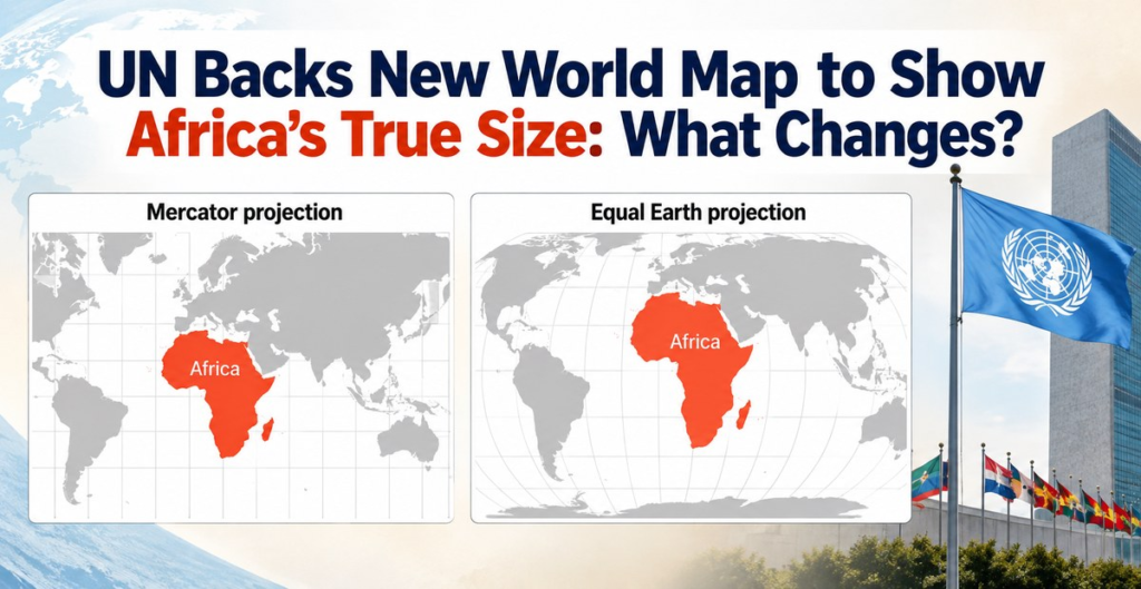
Look at a typical world map, and you might think Greenland is almost as large as Africa. It is not. Africa is about 14 times larger than Greenland. So why does it often look so small on maps? The reason is something called a map projection, the method used to turn our round Earth into a flat map. Now, the United Nations has backed a resolution encouraging countries and organisations to use maps that represent the size of continents more accurately, particularly Africa. The resolution was approved by the UN General Assembly on September 04, 2026, with 164 countries voting in favour, six abstaining and the United States voting against it. India also voted in favour.
Why does Africa look smaller on many world maps?
The map many people are familiar with is based on the Mercator projection, created by Flemish cartographer Gerardus Mercator in 1569. It was designed mainly to help sailors navigate, because it makes directions and angles easier to plot. But there is a catch. When the round Earth is flattened into a rectangle, some areas become stretched. Places farther north or south of the Equator appear much larger than they really are. That means:
- Africa looks smaller than its actual size.
- Greenland looks much bigger than it really is.
- Europe and North America also appear larger relative to Africa.
- Areas close to the Equator are generally shown with less size distortion.
So, the Mercator map is not simply a “wrong map”. It was designed for a particular purpose, especially navigation. The problem comes when we use it to compare the actual sizes of continents and countries.
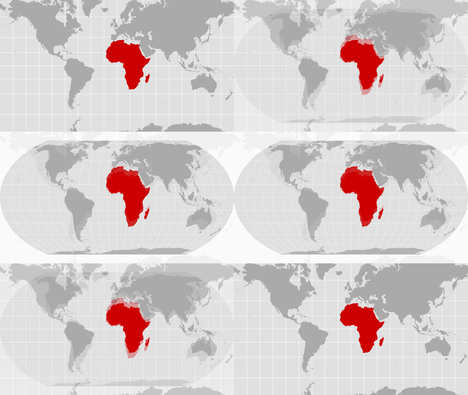
How big is Africa really?
Africa is the second-largest continent in the world, covering about 30.3 million square kilometres. It is so large that several major countries and regions could fit inside it. For example, Africa is big enough to contain the United States, China, India and much of Europe, with land still left over.
One of the easiest ways to understand the distortion is to compare Africa with Greenland.
- Africa covers around 30.3 million square kilometres.
- Greenland covers about 2.16 million square kilometres.
That means Africa is roughly 14 times larger. Yet on a traditional Mercator world map, the two can appear surprisingly similar in size.
What is Equal Earth – the new world map?
The UN resolution points towards equal-area map projections, which preserve the relative size of land areas much better. One projection highlighted in the discussion is called Equal Earth. It was developed in 2018 and is designed to show continents in proportions that are much closer to their actual areas. On an Equal Earth map, Africa looks much larger compared with Europe and Greenland.
However, there is an important detail: the UN has not ordered every country to replace the Mercator map with Equal Earth. The resolution encourages governments, schools, international organisations and technology companies to consider equal-area projections that provide a more accurate picture of the world’s landmasses. India also clarified that its support was for the wider use and consideration of equal-area projections, not for one specific map projection.
Why does this map matter?
A map may seem like just a picture of the world, but maps influence how we understand our planet. For children learning geography, the size of a country or continent on a map can shape how they imagine the world. If one continent repeatedly looks much smaller than it really is, we may not develop an accurate sense of its size.
The African Union has supported the campaign behind the UN resolution, arguing that correcting these distortions can help create a fairer representation of Africa in education, media and other areas. The campaign, known as “Correct the Map”, was led at the UN by Togo.
Does this mean the old world map will disappear?
No, not immediately. The UN resolution is not legally binding, and it does not ban the Mercator projection. The Mercator map remains useful for some purposes, particularly navigation. Instead, the resolution encourages countries and organisations to use maps that are more suitable when the goal is to compare the actual size of different parts of Earth.
This is important because there is no single perfect flat map of Earth. A globe can show the planet without flattening it, but when we turn that globe into a flat sheet, some type of distortion is unavoidable. Different map projections are designed to preserve different things, such as size, shape, distance or direction.
What is India’s vote in changing the world map?
India voted in favour of the UN resolution. However, India made its position clear: supporting more accurate world maps does not mean supporting any particular representation of India’s territory. India’s Permanent Mission to the UN said the resolution should be understood as supporting the broader use of equal-area projections and stressed that India’s territorial boundaries must be shown according to its official position.
Quick facts to remember
- Africa is much larger than Greenland, even though they can look similar on a Mercator map.
- The Mercator projection was created in 1569, mainly to help with navigation.
- Equal Earth is a newer projection designed to represent the relative areas of continents more accurately.
- 164 countries supported the UN resolution on September 04, 2026.
- India voted in favour.
- The resolution does not ban the Mercator projection.
- The UN is encouraging the use of maps that give a fairer picture of the actual size of Earth’s landmasses.
FAQs about the new world map
Why does Africa look smaller on the world map?
Africa often looks smaller because the widely used Mercator projection stretches areas farther from the Equator. This makes northern regions appear much larger compared with areas around the Equator.
Is Africa really bigger than Greenland?
Yes. Africa is about 14 times larger than Greenland in area, even though they can look similar in size on a Mercator map.
What is the Mercator projection?
The Mercator projection is a type of world map created by Gerardus Mercator in 1569. It was designed mainly to help sailors navigate by making directions easier to plot.
What is the Equal Earth map?
Equal Earth is a map projection developed in 2018 that aims to show the relative sizes of continents more accurately than the Mercator projection.
Did the UN change the world map?
The UN General Assembly approved a resolution encouraging the use of map projections that represent the relative sizes of land areas more accurately. It does not mean that one new map has immediately replaced every existing world map.
Did India vote for the new world map?
Yes. India voted in favour of the UN resolution. India also clarified that it supports the broader use of equal-area projections rather than endorsing one specific map projection.
Will the Mercator map disappear?
No. The UN resolution is not legally binding and does not ban the Mercator projection. It encourages the use of more accurate equal-area maps where comparing the size of landmasses is important.
Why is the UN changing the world map?
The resolution aims to encourage more accurate and equitable representations of the sizes of continents and regions, particularly Africa, which appears much smaller on the Mercator projection than its actual area.
So, is the world map really changing?
Yes, but not overnight. The UN vote is an important push towards maps that give a more accurate picture of the relative sizes of continents. It does not mean that every map hanging in a classroom or appearing online will suddenly change.
What is a map projection?
A map projection is a method of showing the round Earth on a flat surface. Because Earth is curved, flattening it always creates some kind of distortion.
Is there a perfect world map?
No. Every flat world map has some distortion. Different projections are designed for different purposes, such as navigation, showing accurate areas or preserving shapes.
How big is Africa?
Africa covers about 30.3 million square kilometres, making it the world’s second-largest continent.
Why are maps important for children?
Maps help children understand where places are and how the world is organised. Choosing an appropriate map also helps build a more accurate understanding of the size and shape of different regions.
Also read:
- World Countries and Their Currencies: Ultimate GK Guide for Students
- 10 Most Important Straits You Should Know
- Social Media Limits for Kids: Countries Take Stricter Action!
- World’s most peaceful country: Iceland!
- United Nations Vote Puts Climate Action In The Spotlight!
Subscribe to The Junior Age Newspaper – click here. Know more fun facts on The Junior Age’s YouTube!